

How might we improve the patient management portal used by behavioral therapists?
Creating a seamless experience for behavioral therapists.
The Scope
This U.S Healthcare Network provides behavioral care to its patients. The project focused on redesigning a patient management portal used by behavioral therapists in clinical settings. Our goal was to improve the overall user experience by streamlining key workflows such as referral management, session note-taking, daily task tracking, and appointment scheduling.
The Project
Client:
Role: UX Researcher & Designer
The Solution
A re-imagined platform that molds to the therapists’ daily workflow versus therapists having to adjust their workflow to meet the platform.
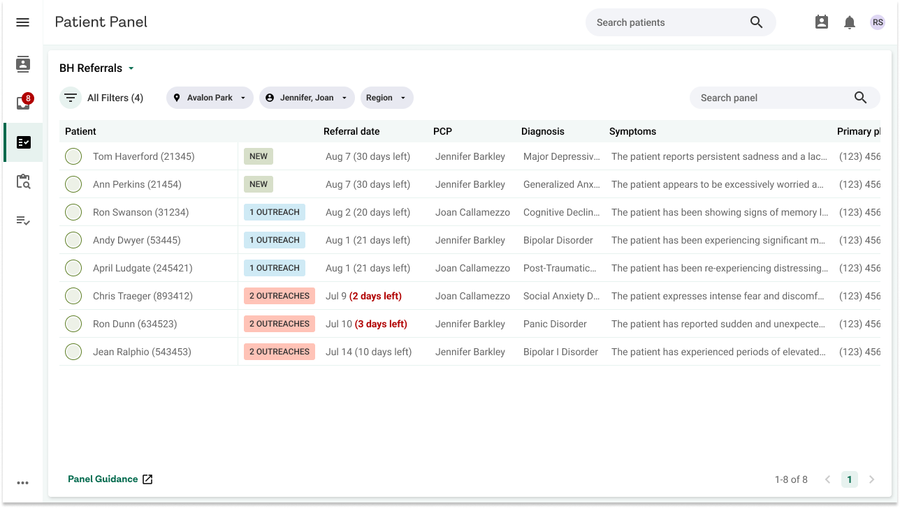
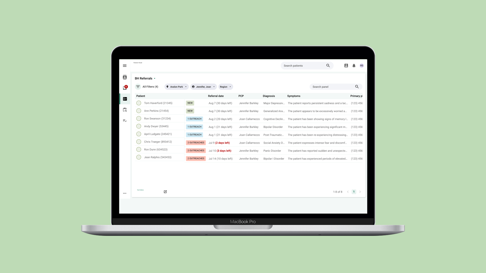
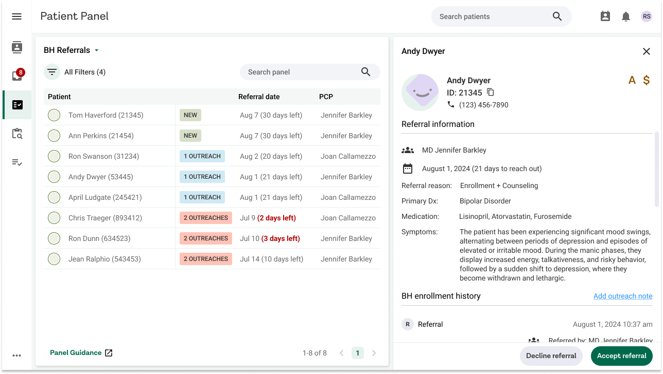
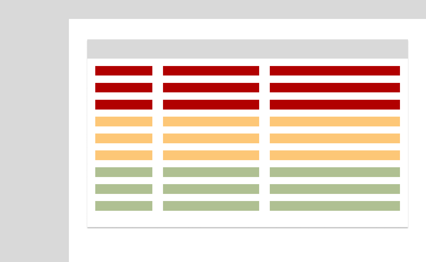
A clean home screen that shows behavioral therapists the immediate information that they need. This addresses a pain point discovered during research where therapists states that the current platform showed too many unnecessary columns and made it difficult to identify the key content. The color labels indicate the number of outreach attempted to schedule a patient.
I helped design a home page that surfaces key referral details upfront, allowing therapists to assess and respond to new referrals without navigating away from the screen.
The content and layout were directly informed by user interviews, focusing on the specific information therapists need to decide whether to accept or decline a referral. By reducing the need to switch between multiple pages, we streamlined a previously fragmented workflow and made referral management faster and more intuitive.
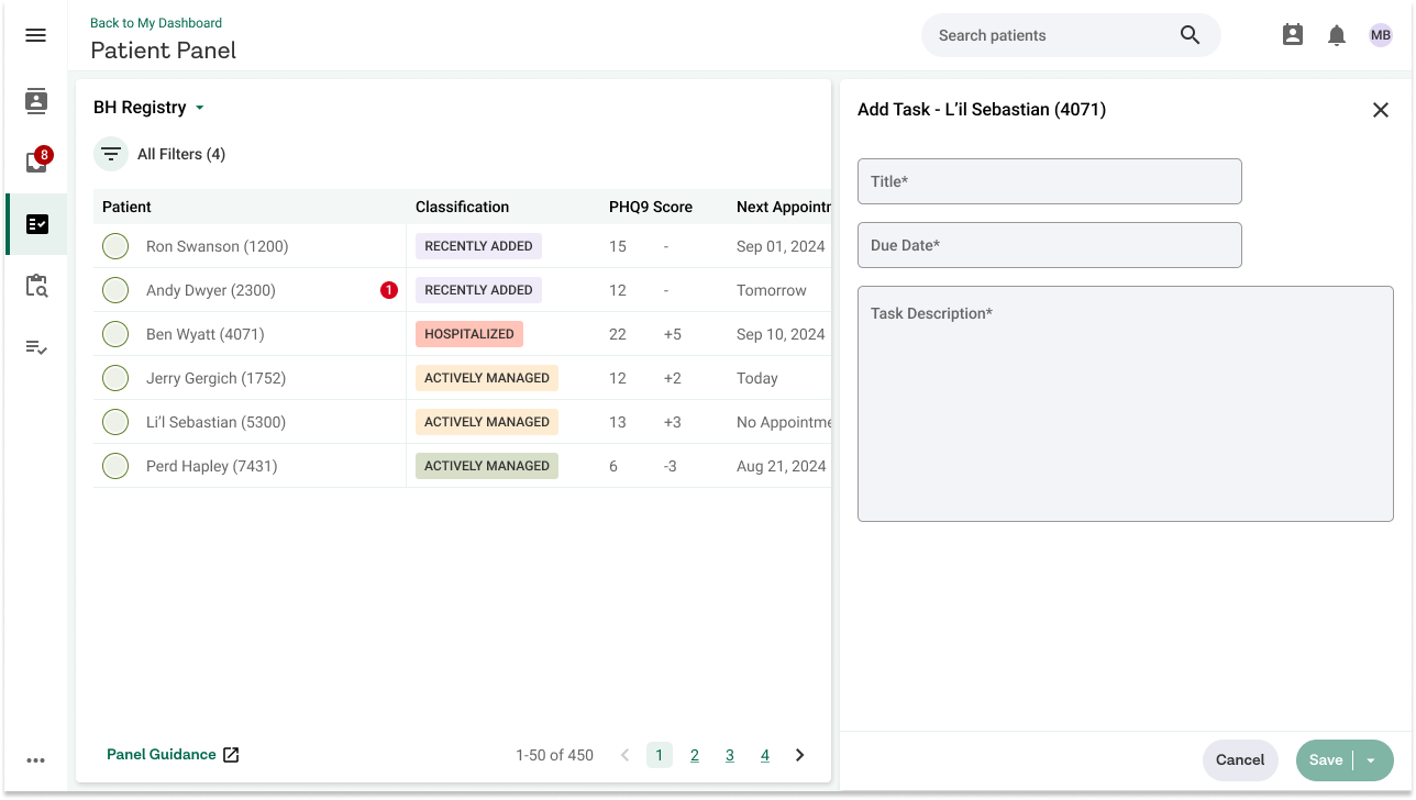
Through our research, I learned that therapists were manually creating daily task lists outside of the current platform just to manage patient-related to-dos. This reliance on multiple tools added unnecessary friction to their workflow.
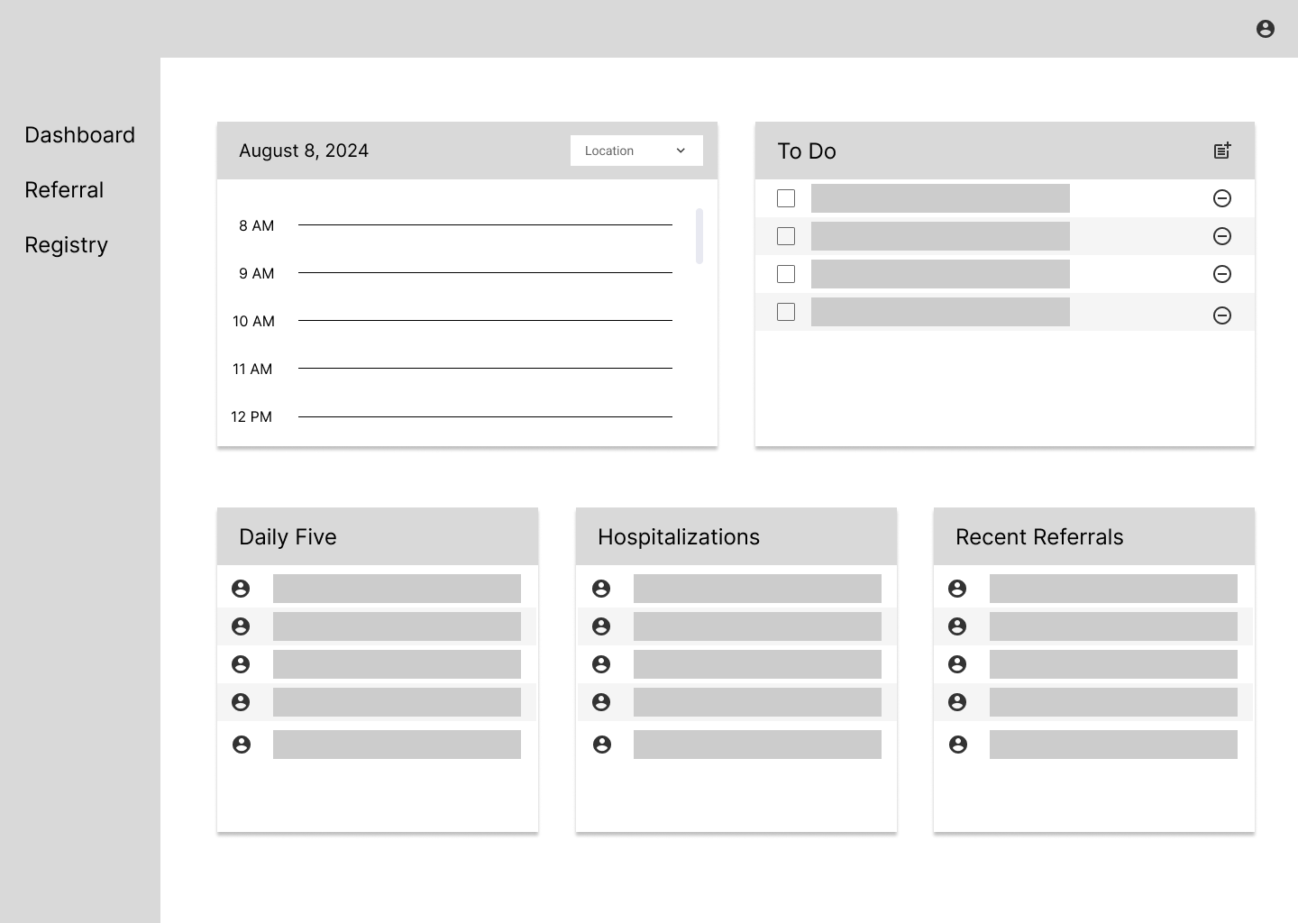
To address this, I introduced a tasks feature that allows users to create and manage to-dos directly within the system, linked to individual patient profiles. This integration keeps everything in one place, helping therapists stay organized without leaving the platform.
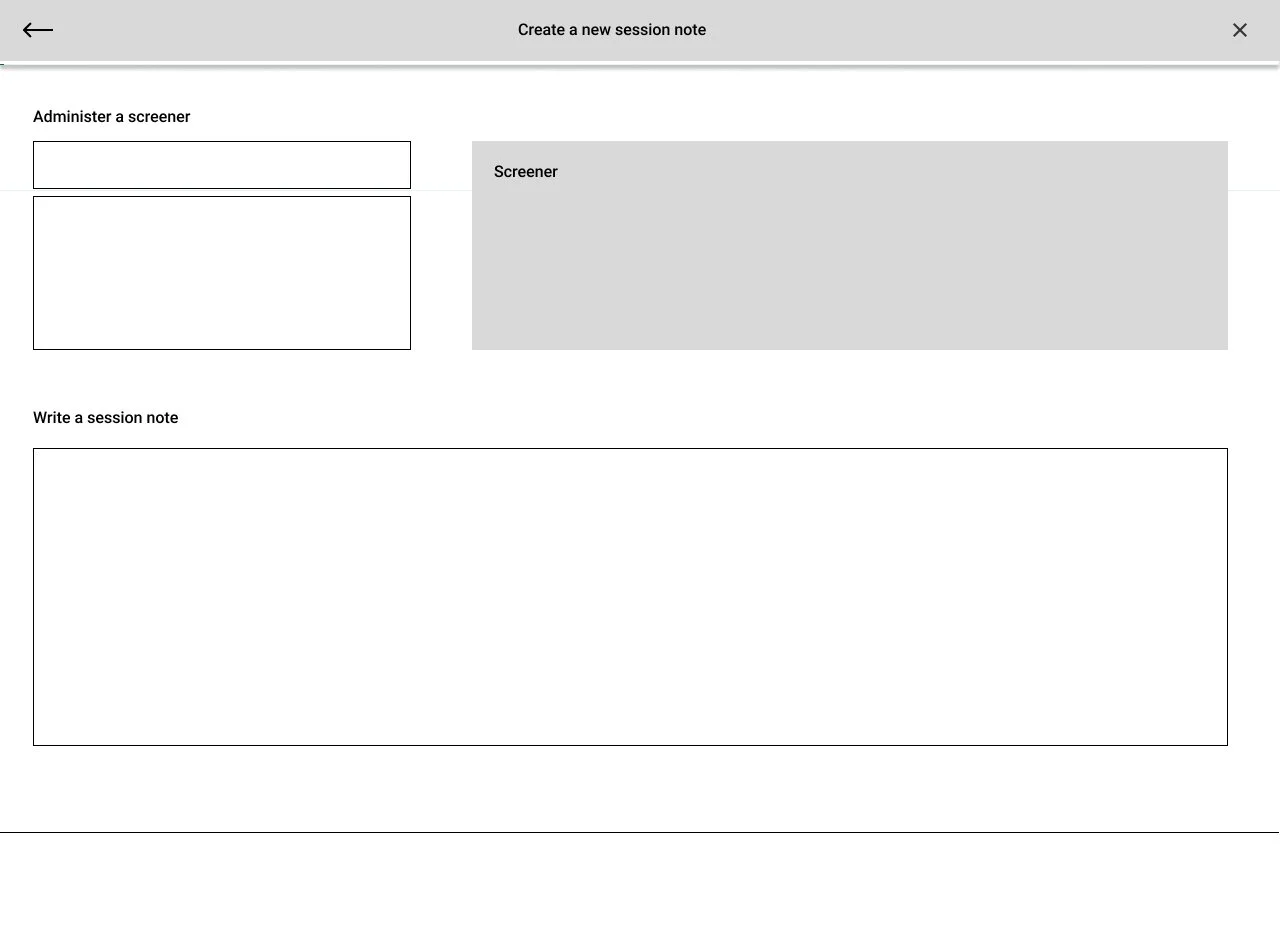
Notes management was one of the biggest pain points uncovered in our research. Therapists often wrote notes outside the platform due to the lack of structure and a visually overwhelming interface and would later copy and paste them in.
To solve this, I helped design a clean, structured notes interface that brings all required fields into a single, organized view. This reduces cognitive load and makes documentation faster, easier, and more consistent. It also eliminates the need for external tools and helps therapists stay focused on patient care.
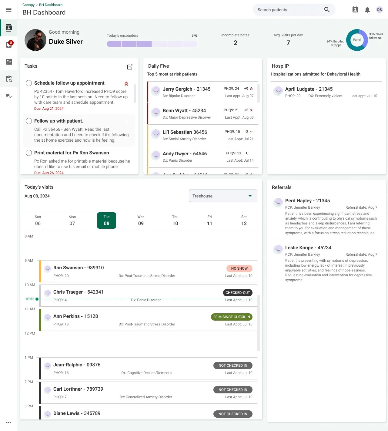
To address the frequent frustration of navigating multiple tabs, we designed a centralized dashboard that brings together key information in one clean, accessible view.
Therapists can now see patient details, daily tasks, and upcoming appointments all in one place. This eliminates the need to switch between screens and streamlines their workflow from the start of the day.
The Process
Discovery & Research
To understand the behavioral therapists’ needs, our team conducted on-site visits to several clinics where the patient management portal was actively in use. These visits allowed us to observe the tool in the context of real-world workflows and gather first-hand insights into the day-to-day challenges therapists face. During our sessions, I asked open-ended questions to uncover pain points with the current system and invited therapists to walk us through their typical routines from preparing for a session to documenting progress and scheduling follow-ups. This contextual inquiry approach provided a clear window into their cognitive load, time constraints, and workarounds.
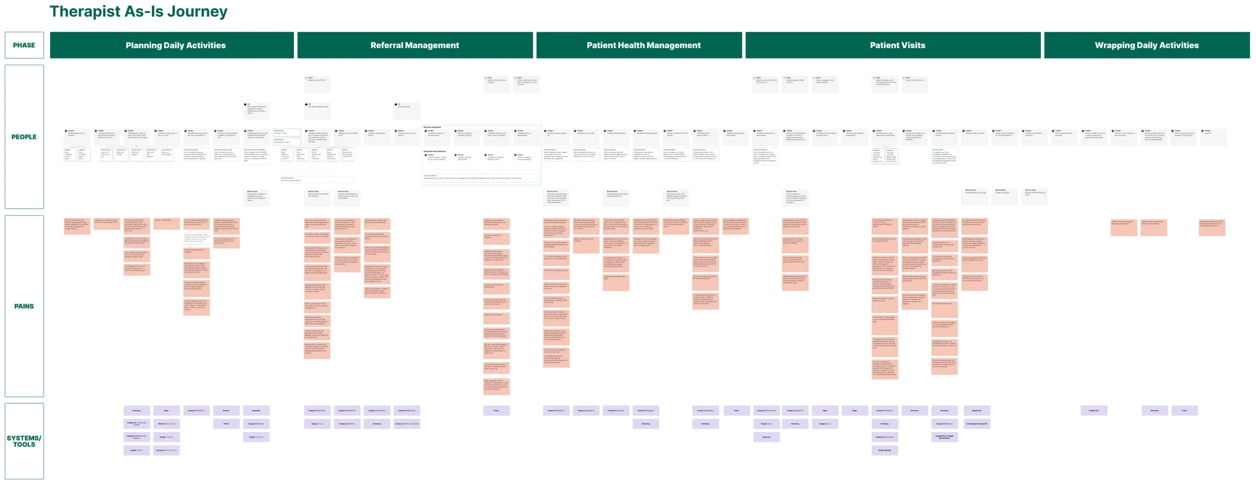
From these observations and conversations, I helped create an "As-Is" journey map that visualized the current state of the therapists' workflow. The journey highlighted key phases such as session preparation, note-taking, patient management, and follow-up tasks. This helped surface critical moments where the existing system was creating friction such as difficulties accessing previous session notes, redundant data entry, and a lack of integration between scheduling and documentation tools.
These insights laid a strong foundation for identifying areas of opportunity and informed our design goals moving forward.
Initial Findings
Behavioral therapists use multiple tools to complete their workflow.
Platform is unreliable so some users will resort to manual note-taking or Google docs before transferring it into the platform.
Communication between different providers for the same patient is disconnected.
Design Workshop
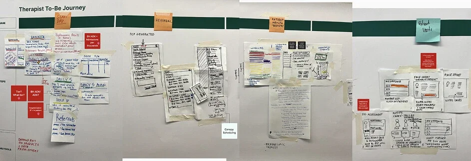
Following our initial user interviews and the creation of the “As-Is” journey, I helped conduct a co-creation workshop with behavioral therapists to collaboratively ideate solutions. The goal was to directly involve end users in the early stages of design to ensure the concepts we developed were rooted in their real-world needs and experiences.
I co-facilitated this in-person session with a focus on participatory design, inviting therapists to help shape the future of the tool they use daily. We guided them through a series of structured, hands-on activities designed to surface creative ideas while staying grounded in the workflow challenges we had previously uncovered.
We started broad, assigning each therapist pair a different phase of the workflow identified in the As-Is journey. From there, we led them through several exercises:
HMW Statements: Each pair crafted “How Might We” questions based on their assigned workflow phase, reframing their pain points as opportunities.
Crazy 8s : To encourage divergent thinking, participants quickly sketched eight solution ideas in eight minutes.
Storyboard Activity : Each pair selected one idea to develop further, illustrating the problem, solution, and outcome in a 3-frame storyboard.
Concept Worksheet: Therapists then built out their idea in more detail, describing the user need, proposed features, and how the solution addressed the pain point.
Lo-Fi Wireframes: Finally, they translated their concept into basic interface sketches, imagining how the redesigned tool might look and function.
The output from this workshop provided us with a rich set of user-generated ideas, artifacts, and low-fidelity concepts that became a strong foundation for our next phase: synthesizing and evolving these into hi-fidelity designs.
This session was invaluable not just for the ideas it produced, but for the shared sense of ownership it fostered among the therapists. By involving them early and meaningfully, we ensured our design direction was aligned with their actual needs, not just assumptions.
Concept Generation & Usability Testing
After the design workshop, I synthesized the ideas and low-fidelity sketches generated by the therapists into actionable design directions with my team. These user-driven concepts gave us a strong foundation to begin creating hi-fidelity prototypes that brought their ideas to life with greater clarity and visual structure.
I iterated on these prototypes through multiple feedback sessions with stakeholders and internal reviews. Each round helped us refine the interface, prioritize the right features, and ensure alignment with both user needs and business goals.
To evaluate the effectiveness of the new designs, we conducted a task-based usability test using the hi-fidelity prototypes. Therapists were asked to complete realistic workflows such as reviewing a referral, adding a patient task, or documenting session notes within the new platform.
The feedback was overwhelmingly positive. Users appreciated the clean visual design, the ease of accessing important information, and how everything was now consolidated into one intuitive interface. Their responses validated our design direction and confirmed that we were meaningfully reducing friction in their daily workflow.
Reflection
This project reinforced the importance of designing with users, not just for them. By spending time in the therapists’ environment, co-creating solutions, and listening closely to their pain points, we were able to build a tool that genuinely supports their day-to-day work. Collaborating directly with end users helped us uncover challenges that weren’t obvious at first glance and shaped solutions that were both practical and meaningful. I learned how powerful it can be to embed user voices throughout the design process, and I’m excited to carry that mindset into future projects.